Monday, 7 November 2011

Shortlist and Final Image - MAC cosmetics

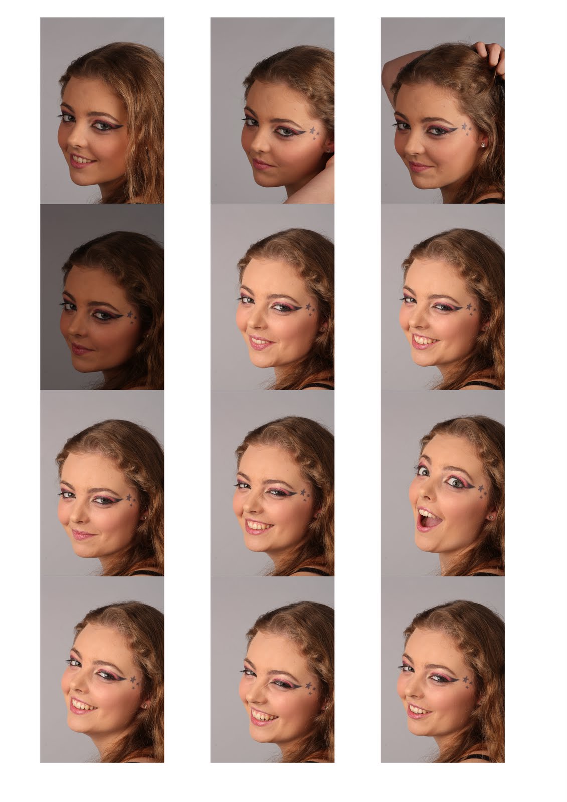
Below are the images I shortlisted from the MAC shoot.
It's very hard to select a final image! I hope you'll agree with my chosen photo!

These are unedited, with the exception of the final image at the very bottom.


Some of these are nice photos of Toni, but I've observed that MAC's advertising campaigns don't tend to include smiley pictures. So that helped me pick the one I picked.


I quite like this angle...


This is a risky decision, as this image is a bit over exposed, but I liked the 'High Key' effect and it was rather flattering.

That's why, after much deliberation, I chose it and edited to make it my FINAL IMAGE.


I think it works. I hope you'll agree.

Besides adding the brand name to the photo, I softened the skin, got rid of some lines (such as under the eyes), saturated the lipstick and eyeshadow, increased the contrast on the eyes...
I followed Scott Kelby's step by step portrait retouching techniques, from a seminar I attended last year in London.

I'm pleased with the outcome.

What do you think?

Portrait Shoot - MAC cosmetics

I chose MAC cosmetics as my brand for the portrait shoot.

This was my first time doing portraits in a studio, and it was an interesting experience, from which I learned a lot.

One of the negatives is depending on another person to model for you (as a favour, at this stage), and unfortunately I was let down by my model the night before the shoot.
Luckily, Toni, who was originally going to be my assistant, saved my life by modelling for me instead.
I had to improvise some make up (the previous model is also a make up artist), and it was particularly funny when the fire alarm went off half way through the make over =P Toni was super embarrassed about having to leave the building like that... and I was concerned about how much of my studio time that was going to consume.
As soon as we returned to the building we just cracked on and despite the delayed start, it was enough time =)

I used Canon 450D as usual, Canon 18-55mm lens and borrowed a tripod from Uni, which is more solid than the one I have.
We used 2 Bowens lights, one to each side of the camera, with some massive light boxes on them. No reflectors as I had no assistant anymore and was happy enough with the results.
I was determined to have fun on the shoot too, and asked my model to throw her hair in the air, spin around, jump, all sorts =)
Turns out it's much harder than I thought to get a good photo doing these movements! But it was great to give it a go!
I then decided to swap lenses and borrowed a macro from Uni. What a great idea that was!! I much preferred the photos taken with this lens (I really want a macro lens! Did you hear me, Father Christmas??).

Holding the hair up...
Some of the photos were never really meant to be the final images, but it's all good!
I surprised her by taking some when she wasn't expecting... some are good and spontaneous, some are just funny and not the most flattering lol
Getting closer and closer...


And to finalise, some more jumping around just for fun!


Shortlist and final image to follow shortly.

Product Shoot - Durex

So my other brand was Durex. I went for it because it's another opportunity to be cheeky, funny and hopefully a little clever too.

This shoot followed the vodka shoot (so unless I mention something new, assume it's the same equipment/settings as Smirnoff's).
The tripod had to be changed again, because this time the camera would have to be facing down. It was the first I used a boom tripod, so that was interesting.

So it started with a constant light soft box, but then I changed it onto flash and 2 MUCH bigger soft boxes.


I selected this image because it's not washed out like some others, doesn't have too many creases on the black fabric underneath to the point it's distracting, the packaging doesn't reflect too much light (you can still see what it is and it preserved the colours okay), neither it is too dark.

Lightroom: Crop + Straightening; Brightness: +3; Contrast: +17


I added some text again on Photoshop.
Also, I used the dodge and burn tools over the condoms to try and even the colours a bit - unfortunately I had to use two different brands of condoms on the shoot, Durex and Boots, and they were quite different, both in colour and in form (Boots' is more photogenic lol). But hopefully it's not too noticeable.


I'm pleased with the outcome once again.

The chosen one - Smirnoff

Selected image:
I chose this photograph because it was well focused on the brand name, I liked the lighting on the bottle, the bra shadows are soft, the bottle faces forward and I liked the composition.
Hopefully it's pretty obvious it's a bra!


Lightroom: WB Temp: -8; Clarity: +100; Vibrance: +18


Final Image:

From the beginning I thought of adding text to the picture.


Photoshop: Cropped bottom (to extend it - did you know you could crop to enlarge? I didn't, until now!); clone-stamped the colour to fill the new area, used the healing brush to blend the tones together, with the colour picker I selected the colour from the top corners and painted them on the bottom with low opacity, then used the healing brush again to make it look more natural and less patchy.
Then added the text onto another layer (font: Impact; 72pt, same colour as the Smirnoff letters - colour picked).


I hope the bra now makes sense and the fact that the bottle is half empty.

I am personally pleased with the outcome. I hope others will also like it.

Product Shoot - Smirnoff Vodka

Finally!! And here are the start of my studio shoots, yay!

One of the products I chose to make an advertising campaign for was Smirnoff Vodka.
Below are the contact sheets of my shoot outcome. The bra will make sense on the final image with the text.

I placed the product and prop on a product table and used a Bowens light (on the right) with a snoot. The intensity was 4.2, though it might have started slightly weaker.
I tried silver reflector on the left, and added later a black card to the right.
Shadows and light were too harsh, so I decided to swap the snoot for a soft box. A "polystyrene wall" was also placed on the right. These changes definitely improved the results.
I also tried using both gold and silver reflectors, and must admit I much preferred the silver than the golden tone - I think it worked especially well when bounced the light back onto the name "Smirnoff".

I changed composition a few times, in order to get a varied range to pic from later. I really wish I had borrowed a smaller sized bra for the shoot, as I believe it would have worked better scale wise.
I also had issues focusing on some of the photos.
I changed tripod onto a more solid one which made a difference too.


Studio Lighting Techniques for Portraits

So, continuing on the studio lighting, below are photos our group took in that session with the different techniques:


Butterfly Lighting
Light is high and in front of the subject, creating shadows under the chin and cheekbones.
The name comes from the shadow under the nose, which resembles a flying butterfly (supposedly - to me it's more like a seagull shape lol).


Broad Lighting
The side of the face nearest to the camera is lit.
This suits people with narrower faces, because it broadens them.


Short Lighting
The side furthest away from the camera is lit.
This narrows the face and can be quite flattering, especially when combined with a reflector.


Side Lighting
Pretty straight forward. The light is placed at either side, giving strong contrast on the shadow side.


Hollywood Lighting
Light is placed at a 90º angle from the camera (in relation to the subject).
It has a very bold feel and was frequently used for Hollywood starts' portraits in the old days.


High Key Lighting
Predominantly light tones. Intentionally overexposed. Connotations of purity, innocence and freshness.


Low Key Lighting
A concentration of darker tones. Intentionally underexposed. Connotations of mystery, threat and a certain moodiness.

Please note Rembrandt Lighting was included on previous post.


This post contains some extracts from the handout.

Rembrandt Lighting

Firstly, I'd like to say: I deserve an A+ for effort (okay, maybe I'm exaggerating a bit), but it's my first day in Brazil, it's 28ºC out there, I could be spending my time seeing my friends who I haven't seen in over 2 years, could be with my lovely grandma, but no, I'm in a room doing work for Uni =( Please appreciate my effort, even if I'm still behind!

Okay, I feel slightly better after that =P

Anyway!!
On October 11th we had a workshop on different types of studio lighting for portraits. One of them was Rembrandt Lighting.

Rembrandt Lighting is named after the Dutch painter because he often used this lighting on his portraits.


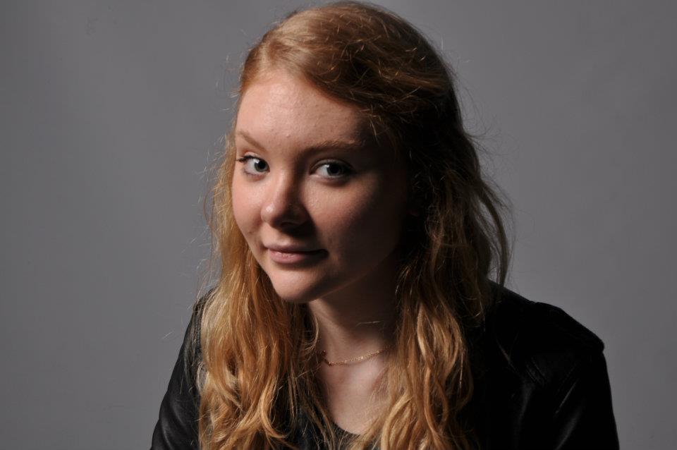
The key light is placed high up, on the front, to one side of the subject. To the other side of the camera, a reflector or fill light is used, at half-height and half power of the key light. If the model faces the camera at an angle, the key light should illuminate the far side.


The main characteristic of the Rembrandt lighting is that a triangle of light will form under the eye (of the darker side of the face). This triangle should be no longer than the nose and no wider than the eye.

Below is one of our group's photo that depicts this technique: